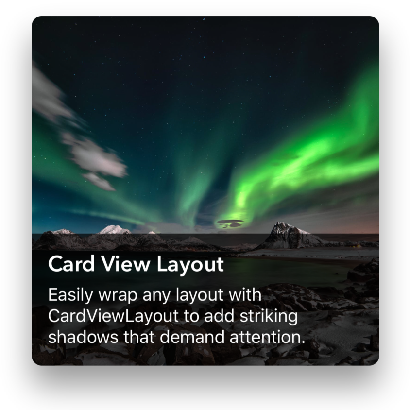
Card View Layout Control
The Card View Layout lets you create views in similar vein to iOS App Store 'cards'.
Properties
Elevation - double
Gets or sets the elevation.
Content - View
Gets or sets the content to display.
BackgroundColor - Color
Gets or sets the color of the background card.
BorderColor - Color
Gets or sets the color of the border.
BorderSize - double
Gets or sets the size of the border. Default is 0d.
CornerRadius - double
Gets or sets the corner radius. Default is 4d.
Example Usage
Xaml
<aurora:CardViewLayout x:Name="control"
                Margin="24,24,24,24" BackgroundColor="Fuchsia"
                Grid.Row="1" Grid.Column="0">
                <aurora:CardViewLayout.Content>
                    <Grid x:Name="content">
                        <Grid.RowDefinitions>
                            <RowDefinition Height="Auto" />
                            <RowDefinition Height="Auto" />
                            <RowDefinition Height="*" />
                            <RowDefinition Height="Auto" />
                        </Grid.RowDefinitions>
                        <Image Aspect="AspectFill" Source="http://i.onionstatic.com/avclub/5800/64/16x9/960.png"
                            Grid.Column="0" Grid.Row="0" Grid.RowSpan="4"/>
                        <Label Text="WORLD PREMIERE"
                            TextColor="White" FontAttributes="Bold" Margin="16"
                            Grid.Column="0" Grid.Row="0" />
                        <Label Text="The Art of the Dingus"
                            TextColor="White" FontSize="30" FontAttributes="Bold"  Margin="16"
                            Grid.Column="0" Grid.Row="1" />
                        <Label Text="Inside the wonderful world of Dr. Steve Brule. For Your Health."
                            TextColor="White" FontAttributes="Bold" Margin="16"
                            Grid.Column="0" Grid.Row="3" />
                    </Grid>
                </aurora:CardViewLayout.Content>
            </aurora:CardViewLayout>
C#
var card = new CardViewLayout
{
    CardBackgroundColor = Color.Green,
    ShadowColor = Color.Black,
    CornerRadius = 12
};
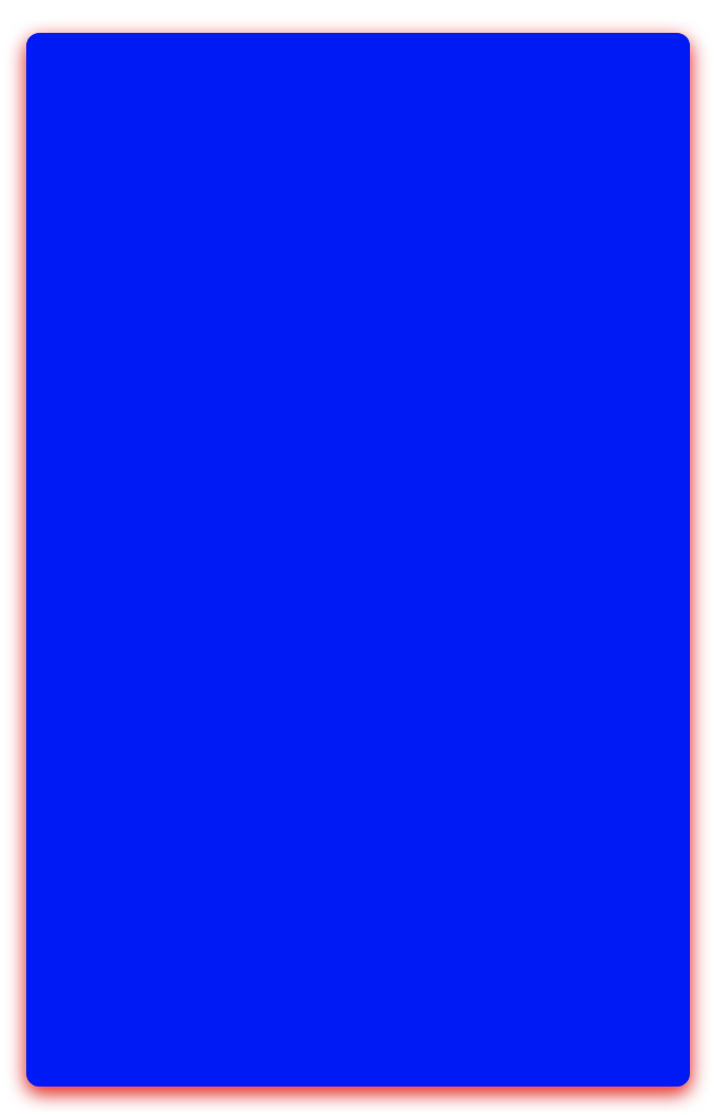
Example Styles
A Card with a CornerRadius of 12, CardBackgroundColor of Blue and ShadowColor of Red:
A Card with a CornerRadius of 2, CardBackgroundColor of Black and ShadowColor of Purple: