Is Iconified Text
The IsIconifiedText property on certain Aurora controls will allow you to set special text files as the control's title text. These text files (icofont) contain special icon characters that can be used to give your controls a more unique look.

The following controls support iconified text:
- Chip
- Cupertino Button
- Flat Button
- Gradient Pill Button
- Segmented Control
- Tile
Using Iconified Text with Controls
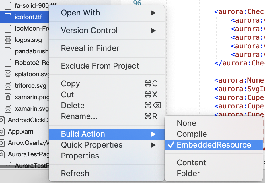
- Be sure to add the font as an EmbeddedResource to your project.
- Set the IsIconifiedText property on the control to true.
- Reference the font in the Text property using a double-brace notation. The following example illustrates this syntax:
IsIconifiedText="True" Text="I {{icofont.ttf ec1e color=ff0000}} to {{icofont.ttf eeea}}"
Use double curly braces to open and close the area where the iconified font will be used within the Text property. Within the braces, the following parameters must be specified:
- First parameter: the font name.
- Second parameter: the hex value of the character you want to display.
Additionally, there are two optional parameters that may be used. They are:
- Color: the hex value of the desired color.
- Font-size: the float value for font size.