Material Toggle Switch
Material Toggle Switch provides a switch in the style of Android's Material design.
Properties
InactiveThumbColor - Color
Gets or sets the inactive thumb color. Default value is Color.White.
ActiveThumbColor - Color
Gets or sets the active thumb color. Default value is Color.White.
TrackEnabledColor - Color
Gets or sets the enabled track color. Default value is Color.Green.
TrackDisabledColor - Color
Gets or sets the disabled track color. Default is #B0AFAF.
ToggleAnimationDuration - uint
Gets or sets the duration of the toggle animation. Default is 240u.
ToggleMaxWidth - double
Gets or sets the max width of the toggle. Default is 56d.
ToggleMaxHeight - double
Gets or sets the max height of the toggle. Default is 32d.
Command - ICommand
Gets or sets the command.
CommandParameter - object
Gets or sets the command parameter.
IsToggled - bool
Gets or sets a value that indicates if the switch is toggled.
Example Usage
Xaml
<aurora:MaterialToggleSwitch x:Name="MaterialToggleSwitch" WidthRequest="80" TrackEnabledColor="Blue" />
C#
var toggle = new MaterialToggleSwitch
{
    ActiveThumbColor = Color.Brown,
    TrackEnabledColor = Color.ForestGreen,
    ToggleAnimationDuration = 24
}
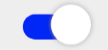
Example Styles
A switch with TrackEnabledColor of Black and ActiveThumbColor of Green:

var example = new MaterialToggleSwitch
{
    ActiveThumbColor = Color.Green,
    TrackEnabledColor = Color.Black
}
<aurora:MaterialToggleSwitch x:Name="example" ActiveThumbColor="Green" TrackEnabledColor="Black" />
A switch with TrackDisabledColor of Purple and InactiveThumbColor of Red:
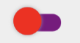
var example = new MaterialToggleSwitch
{
    InactiveThumbColor = Color.Red,
    TrackDisabledColor = Color.Purple
}
<aurora:MaterialToggleSwitch x:Name="example" InactiveThumbColor="Red" TrackDisabledColor="Purple" />