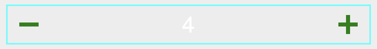
Numeric Bumper Control
The Numeric Bumper Control gives the developer access to a simple number entry that is controlled by plus/minus buttons.
This is good for scenarios where the numbers can be incremented and decremented by a small amount as it gives the user a controlled and simplistic way to edit the value.
Properties
FontColor - Color
Gets or sets the color of the font. Default is Black.
Value - int
Gets or sets the value.
Minimum - int
Gets or sets the minimum value. Default is 0.
Maximum - int
Gets or sets the maximum value. Default is int.MaxValue.
ButtonColor - Color
Gets or sets the color of the button. Default is Xamarin.Forms.Color.Default.
BorderColor - Color
Gets or sets the color of the border. Default is Xamarin.Forms.Color.Default.
ThresholdCommand - ICommand
Gets or sets the threshold command.
ThresholdCommandParameter - object
Gets or sets the threshold command parameter.
ThresholdFeedback - ThresholdFeedbackType
Gets or sets the threshold feedback. Can be set to one of the following:
public enum ThresholdFeedbackType
        {
            None, Grayed, Hidden
        }
ThresholdGray - Color
Gets or sets the threshold gray.
Examples
Xaml
<aurora:NumericBumper FontColor="Blue" BorderColor="Aqua" ButtonColor="Green" Maximum="6" Minimum="0"></aurora:NumericBumper>
C#
var bumper = new NumericBumper
    {
        Minimum = 0,
        Maximum = 15,
        BorderColor = Color.Aquamarine,
        FontColor = Color.Black
    };