Step Indicator
The Step Indicator is a handy UI element indicating to the user which page (or step) they are on during a multi-page process, for example, signing up for a new account.
The indicator can be customized with all manners of colors and sizes and values, making it easy to fit into exactly what is needed within your app's workflow.
Properties
NumberOfSteps - int
Gets or sets the number of steps. Default value is 0.
CurrentStep - int
Gets or sets the current step.
DisplayStepNumber - bool
Gets or sets a value indicating whether the indicator displays step numbers or not.
LineColor - Color
Gets or sets the color of the line. Default is Xamarin.Forms.Color.Default.
LineWidth - double
Gets or sets the width of the line.
HighlightColor - Color
Gets or sets the color of the highlight. Default is Xamarin.Forms.Color.Default.
InactiveColor - Color
Gets or sets the color of the inactive. Default is Xamarin.Forms.Color.Default.
FontColor - Color
Gets or sets the color of the font. Default is Xamarin.Forms.Color.Default.
Padding - Thickness
Gets or sets the padding.
SwitchOnStepTap - bool
Gets or sets a value indicating whether the indicator responds to user touches and thus switches to that step.
Example Usage
Xaml
<aurora:StepIndicator x:Name="control" NumberOfSteps="5" CurrentStep="3" LineColor="White" InactiveColor="Red" HighlightColor="Lime" FontColor="Gray" LineWidth="6" SwitchOnStepTap="true" />
C#
var step = new StepIndicator
{
    HighlightColor = Color.Magenta,
    LineWidth = 10,
    LineColor = Color.LimeGreen,
    Padding = new Thickness(4),
    NumberOfSteps = 3,
    DisplayStepNumber = true
};
Example Styles
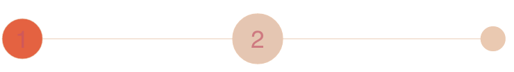
This is an indicator with 5 steps and the third currently highlighted. Notice the blue highlight and red inactive steps:
var example1 = new StepIndicator
{
    HighlightColor = Color.Blue,
    InactiveColor = Color.Red,
    NumberOfSteps = 5,
    CurrentStep = 3,
    DisplayStepNumber = true
};
<aurora:StepIndicator x:Name="example1" NumberOfSteps="5" CurrentStep="3" InactiveColor="Red" HighlightColor="Blue" DisplayStepNumber="true" />
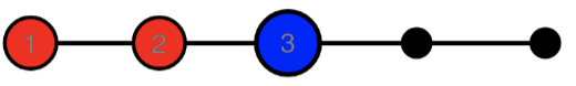
This is an indicator with 3 steps, black inactive and green active highlights, and a grey line:

var example1 = new StepIndicator
{
    HighlightColor = Color.Green,
    InactiveColor = Color.Black,
    NumberOfSteps = 3,
    DisplayStepNumber = true
};
<aurora:StepIndicator x:Name="example2" NumberOfSteps="3" InactiveColor="Black" HighlightColor="Green" DisplayStepNumber="true" />