Float Label Entry Control
The Float Label Entry Control allows a multitude of ways to customize a text entry field, giving the developer near total control of the look and feel of the field itslef.
Properties
Text - string
Gets or sets the text value of the Entry.
EditingView - View
Gets or sets the editing view.
EditingViewHeight - GridLength
Gets or sets the height of the editing view. Default value is GridLength.Star.
ActiveColor - Color
Gets or sets the color of the active control. Default value is Xamarin.Forms.Color.Black.
InactiveColor - Color
Gets or sets the color of the inactive control. Default value is Xamarin.Forms.Color.DimGray.
Disabled - bool
Gets or sets a value indicating whether or not the control is disabled.
DisabledColor - Color
Gets or sets the color of the control when it is disabled.
ErrorColor - Color
Gets or sets the color of the error. Default value is Xamarin.Forms.Color.Red.
ErrorText - string
Gets or sets the error text.
ContentBackgroundColor - Color
Gets or sets the color of the content background. Default value is Xamarin.Forms.Color.Transparent.
Placeholder - string
Gets or sets the placeholder.
PlaceholderColor - Color
Gets or sets the color of the placeholder. Default is the default OS color.
BorderSize - double
Gets or sets the size of the border. Default value is 1d.
BorderStyle - FloatingLabelContainerBorderStyle
Gets or sets the border style. Can be set to one of the following styles:
public enum FloatingLabelContainerBorderStyle {
    Underline,
    RoundedUnderline,
    Rectangle,
    RoundedRectangle
}
EditingViewMargin - Thickness
Gets or sets the margin between the text and control border. Default value is 2d.
CornerRadius - double
Gets or sets the corner radius. Default value is 4d.
TitleRowHeight - GridLength
Gets or sets the height of the title row. Default value is GridLength.Auto.
ErrorRowHeight - GridLength
Specifies the height of the error row where the provided error text will display. Default value is GridLength.Auto.
TitleFontSize - double
Gets or sets the size of the title font. Default is 11.
ErrorFontSize - double
Gets or sets the size of the error font. Default is 11.
AlwaysShowTitle - bool
Gets or sets a value indicating whether the control always shows the title.
UserEditable - bool
Gets or sets a value indicating whether the control is user editable.
Command - ICommand
Gets or sets the command. Default value is default(System.Windows.Input.ICommand).
CommandParameter - object
Gets or sets the command parameter.
FocusAnimationLength - uint
Gets or sets the length of the focus animation. Default is 250u.
HasValue - bool
Gets or sets a value indicating whether this control has a value.
Example Usage
Xaml
<aurora:FloatLabelEntry x:Name="floatingLabelEntry" Placeholder="Entry" BorderSize="8" BorderStyle="RoundedUnderline" ActiveColor="Purple" InactiveColor="Green" />
C#
var label = new FloatLabelEntry
{
    BorderSize = 3,
    ActiveColor = Color.Azure,
    Placeholder = "Sample",
    PlaceholderColor = Color.Sienna
};
Example Styles
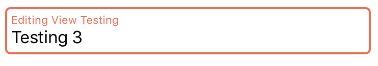
A control with a BorderStyle of RoundedUnderline and InactiveColor of Green:

var example1 = new FloatLabelEntry
{
    BorderStyle = Aurora.Controls.FloatLabelEntry.FloatingLabelContainerBorderStyle.RoundedUnderline,
    InactiveColor = Color.Green
};
<aurora:FloatLabelEntry x:Name="example1" BorderStyle="RoundedUnderline" InactiveColor="Green" />
A control with a ContentBackgroundColor of Olive and BorderStyle of RoundedRectangle:
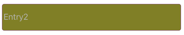
var example2 = new FloatLabelEntry
{
    BorderStyle = Aurora.Controls.FloatLabelEntry.FloatingLabelContainerBorderStyle.RoundedRectangle,
    ContentBackgroundColor = Color.Olive
};
<aurora:FloatLabelEntry x:Name="example2" BorderStyle="RoundedRectangle" ContentBackgroundColor="#808000" />