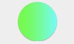
Gradient Circular Button Control
The Gradient Circular Button is a simple way for a programmer to add colorful themed buttons to their app.
Properties
ButtonBackgroundColor Color
Gets or sets the color of the button background. Default is Xamarin.Forms.Color.Default.
BorderWidth double
Gets or sets the width of the border. Default is 0d.
BorderColor Color
Gets or sets the color of the border. Default is White.
ShadowColor Color
Gets or sets the color of the shadow. Default is Color.FromRgba(0d, 0d, 0d, .33d).
ShadowLocation Point
Gets or sets the shadow location.
GradientDirection GradientDirection
Gets or sets the gradient direction. Default direction is Horizontal.
public enum GradientDirection
    {
        Horizontal,
        Vertical
    }
Ripples bool
Gets or sets a value indicating whether button ripples or not.
Command ICommand
CommandParameter object
Example Usage
Xaml
<aurora:GradientCircularButton x:Name="circularButton" ButtonBackgroundColor="Purple" ShadowLocation="0,1" />
cs
var circular = new Aurora.Controls.GradientCircularButton
    {
        Ripples = true,
        BackgroundColor = Color.Aqua,
        BorderWidth = 10
    };