Control Panel Slider
The Control Panel Slider is a multi-purpose control used to change values such as volume and brightness. This is similar to the sliders on the current iOS Control Center screen.
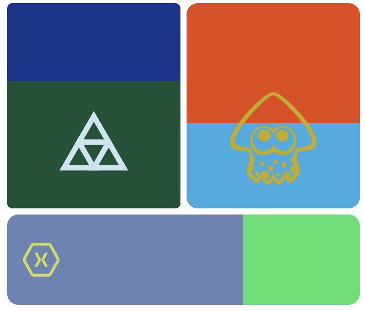
Various sliders:
Properties
Minimum - double
Gets or sets the minimum value. Default is 0d.
Maximum - double
Gets or sets the maximum value. Default is 100d.
Value - double
Gets or sets the value. Default is 0d.
ProgressColor - Color
Gets or sets the progress color. Default is Xamarin.Forms.Color.Default
Orientation - ControlPanelSliderOrientation
Gets or sets the orientation. Default is ControlPanelSliderOrientation.Horizontal. Can be one of the following:
public enum ControlPanelSliderOrientation
    {
        Horizontal,
        Vertical
    }
ProgressBackgroundColor - Color
Gets or sets the progress background color. Default is Xamarin.Forms.Color.Default.
CornerRadius - double
Gets or sets the radius of the corners. Default is 0d.
EmbeddedImageName - string
Gets or sets the name of the embedded image.
EmbeddedImageOverlayColor - Color
Gets or sets the color of the embedded image overlay.
TouchedAnimationDuration - uint
Gets or sets the touched animation duration. Default is 240u.
TouchedAnimationEasing - Easing
Gets or sets the touched animation easing. Default is Easing.CubicInOut.
MaxShrinkPercent - double
Gets or sets the maximum shrink percentage. Default is .1d.
Example Usage
Xaml
<aurora:ControlPanelSlider x:Name="control" Orientation="Vertical" ProgressColor="Red" ProgressBackgroundColor="Gray" EmbeddedImageName="xamarin.svg" />
C#
var slider = new ControlPanelSlider
{
    ProgressColor = Color.White,
    ProgressBackgroundColor = Color.Black,
    Orientation = Aurora.Controls.ControlPanelSliderOrientation.Horizontal
}
Example Styles
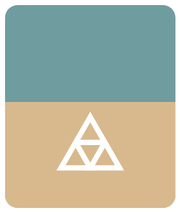
A slider with ProgressColor of BurlyWood, ProgressBackgroundColor of CadetBlue, CornerRadius of 25 and Orientation of Vertical:
var slider = new ControlPanelSlider
{
    ProgressColor = Color.BurlyWood,
    ProgressBackgroundColor = Color.CadetBlue,
    CornerRadius = 25,
    Orientation = Aurora.Controls.ControlPanelSliderOrientation.Vertical
}
<aurora:ControlPanelSlider x:Name="slider" ProgressColor="#DEB887" ProgressBackgroundColor="#5F9EA0" CornerRadius="25" Orientation="Vertical" />
A slider with ProgressColor of DarkSlateGray, ProgressBackgroundColor of Firebrick, CornerRadius of 1 and Orientation of Horizontal:

var slider = new ControlPanelSlider
{
    ProgressColor = Color.DarkSlateGray,
    ProgressBackgroundColor = Color.Firebrick,
    CornerRadius = 1,
    Orientation = Aurora.Controls.ControlPanelSliderOrientation.Horizontal
}
<aurora:ControlPanelSlider x:Name="slider" ProgressColor="##2F4F4F" ProgressBackgroundColor="#B22222" CornerRadius="1" Orientation="Horizontal" />