Circular Exclusion Control
The Circular Exclusion Control gives developers a way to hide the content of another view. In this way, it is similar to the Cutout Overlay View.
Properties
CutoutShape - CircularExclusionShape
Gets or sets the cutout shape. Default is Concave. Can be set to one of the following:
public enum CircularExclusionShape {
    Concave,
    Convex
}
CutoutPercent - double
Gets or sets the cutout percent. Default is 10d.
CutoutDepth - double
Gets or sets the cutout depth. Default is 10d.
CutoutOverdrawPercent - double
Gets or sets the cutout overdraw percent. Default is 10d.
Side - CircularExclusionSide
Gets or sets the side. Default is Bottom. Can be set to one of the following:
public enum CircularExclusionSide {
    Left,
    Top,
    Right,
    Bottom
}
CircularExclusionColor - Color
Gets or sets the color of the circular exclusion. Default is White.
BorderColor - Color
Gets or sets the color of the border.
BorderSize - double
Gets or sets the size of the border.
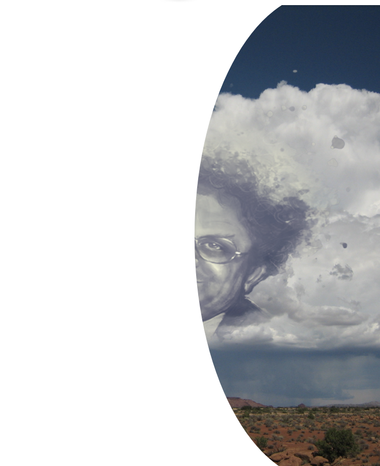
Example Usage
Xaml
<aurora:CircularExclusionView VerticalOptions="FillAndExpand" x:Name="view" Side="Right" CutoutDepth="20" CircularExclusionColor="White" BorderSize="15" BorderColor="Gray" />
C#
var circle = new CircularExclusionView
{
    CircularExclusionColor = Color.Brown,
    Side = Aurora.Controls.CircularExclusionSide.Left,
    BorderColor = Color.Red,
    CutoutPercent = 70
};