Controls Overview
The Aurora controls provide a multitude of ways for you and a user to interact with your app. Everything from entry boxes, to special views, to loading indicators, to pickers, to gauges, Aurora provides a full contingent of what you will need to build, beautiful, stylized, colorful, themed mobile app.
At once highly-customizable and easy-to-use, Aurora controls are powerful enough for a developer to create the interface they expect, with the simplicity of straight-forward, no-nonsense code; you input the values, Aurora makes it look gorgeous. No tinkering. Just fully-functional, attractive controls. And they can be easily used with both Xaml and C Sharp.
These are the types of controls Aurora provides, with a brief explanation of what they do and how they look.
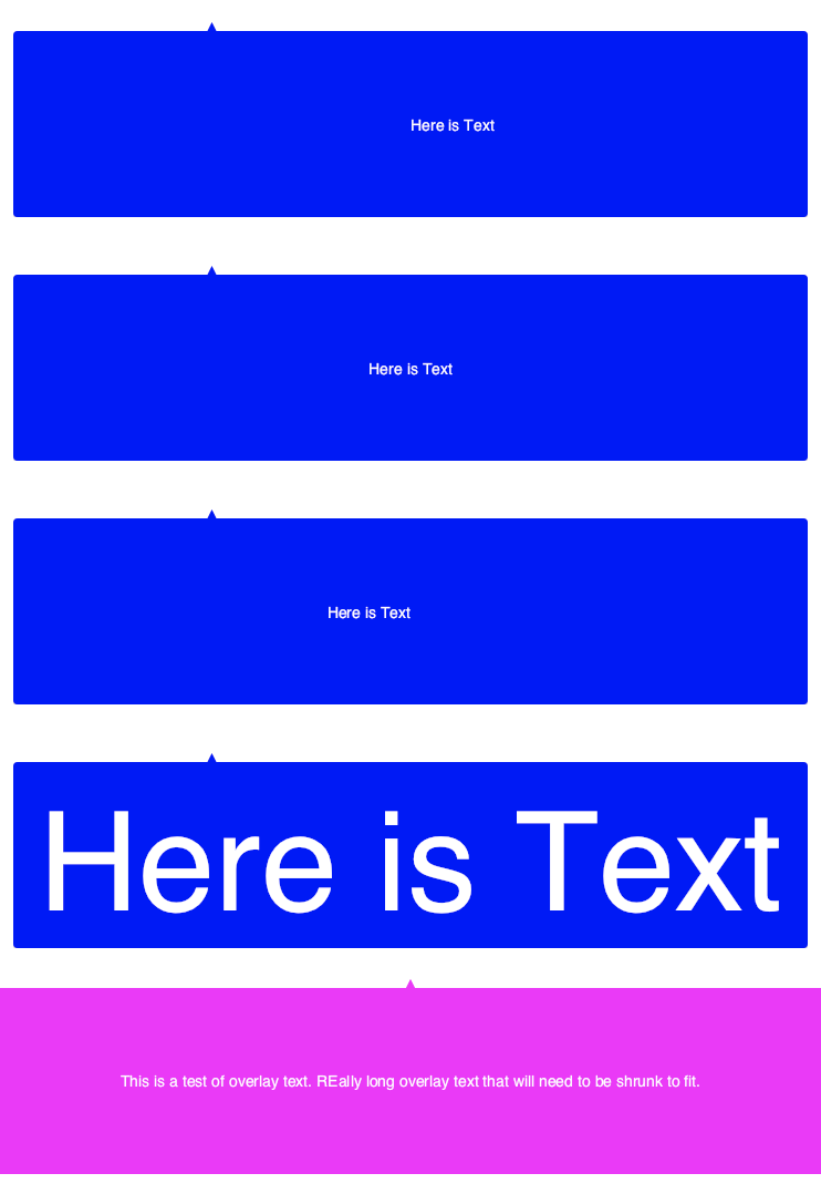
Arrow Overlay View
The Arrow Overlay View is an elegant control used to highlight hard-to-discover portions of your UI, or to reveal more information about it.
Banner View
The Banner control displays slide-out important messages, menus or contextual options.
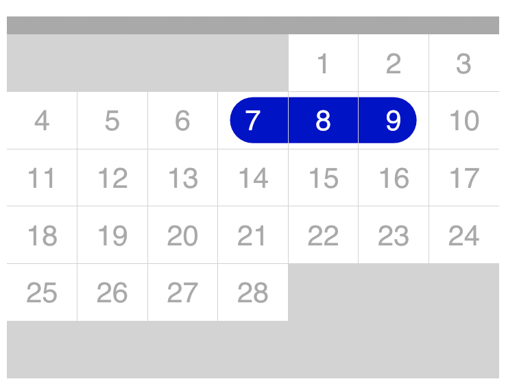
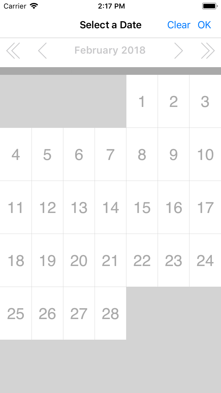
Calendar View
The Calendar View gives a powerful way to manipulate dates.
Calendar Picker View
Like the Calendar View, the Calendar Picker provides the same powerful date selection, but does so as a picker-type control.
Card Layout View
The Card Layout is a great way to create 'cards' containing pictures and text similar in style to the App Store.

Checkbox
The Checkbox presents a control with a variety of for checked items within your app.
Circular Exclusion View
The Circular Exlusion View allows the contents of a view to be hidden.

Circular Gradient View
The Circular Gradient View lets the developer transform any SVG into a gradient effect.

Confetti View
The Confetti View adds some flair to any screen. Turn your app into a party with this celebratory view!
Control Panel Slider
The Control Panel Slider is a multi-purpose control used to change values such as volume and brightness.
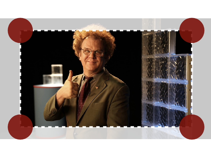
Crop Image Control
The Crop Image control allows the user to crop an image down to the selected size.
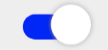
Cupertino Toggle Switch
The Cupertino Toggle Switch mimics the look and feel of switches from iOS.
Cutout Overlay View
The Cutout Overlay View lets a developer shape an image and the area around it.
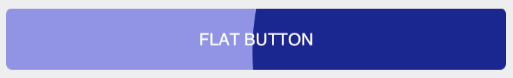
Flat Button
The Flat Button provides a button that will 'fill' with an ink effect as it is held.
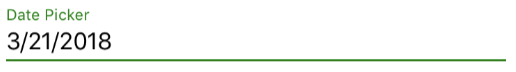
Float Label Date Picker
The Float Label Date Picker is a flexible date entry control.
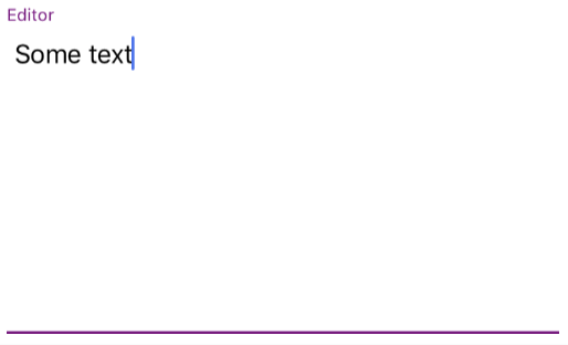
Float Label Editor
The Float Label Editor provides an entry for copious amounts of text.
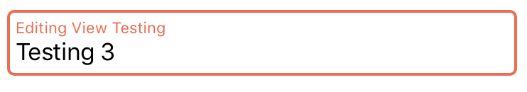
Float Label Entry Control
The Float Label Entry is a text entry field with Aurora flair.
Float Label Nullable Date Picker Control
The Float Label Nullable Date Picker is identical to the Float Label Date Picker except it can be set to null.
Float Label Nullable Time Picker Control
The Float Label Nullable Time Picker is identical to the Float Label Time Picker except it can be set to null.
Float Label Numeric Entry Control
The Float Label Numeric Entry Control allows inputting of numbers with a label identifying what the control is.
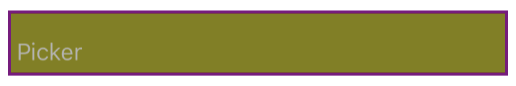
Float Label Picker Control
The Float Label Picker gives developers a picker entry with all the typical Aurora customizability.
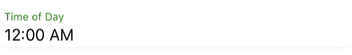
Float Label Time Picker Control
The Float Label Time Picker is a time entry field operated by a picker.
Gradient Circular Button Control
The Gradient Circular Button is a button that displays gradient color. Simple!
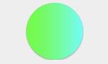
Gradient Color View
The Gradient Color View is an expressive way to add beautiful, blended views into any portion of your app.

Gradient Pill Button Control
The Gradient Pill Button gives you a convenient, pill-shaped button that can be themed.
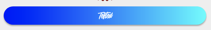
Image Button Control
The Image Button provides you with a control to turn an image into a button and then color and animate it.

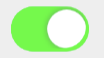
Material Toggle Switch
Material Toggle Switch provides a switch in the style of Android's Material design.
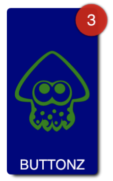
Notification Badge
The Notification Badge allows you implement a badge on icons within your app in the style of badges on iOS and Android.
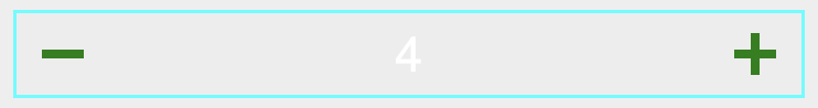
Numeric Bumper Control
The Numeric Bumper Control gives the developer access to a simple number entry that is controlled by plus/minus buttons.
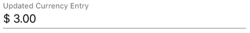
Numeric Entry Control
The Numeric Entry control lets the developer implement text boxes for formatted numbers based on localization and scenario.

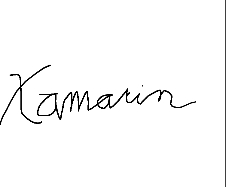
Signature
The Signature control is a simple control for a user to write their signature.
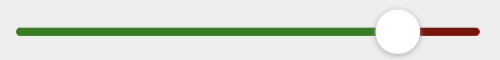
Slider
The Slider is a simple sliding control that mimics those found on other mobile platforms. It is flexible in its look and feel and can be used to track various values across your app.
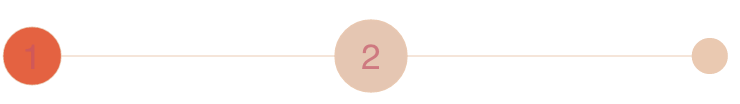
Step Indicator
The Step Indicator is a UI element that indicates the page (or step) a user is currently on during a multistep workflow.
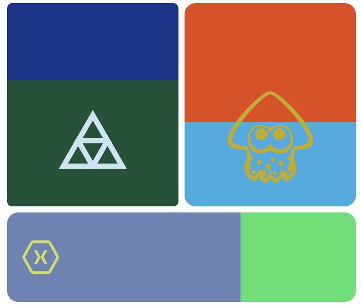
Tile
The Tile control lets you have almost total control over a button's look and feel.
Touch Blur Image
The Touch Blur control lets a user blur an image by touching portions of it.

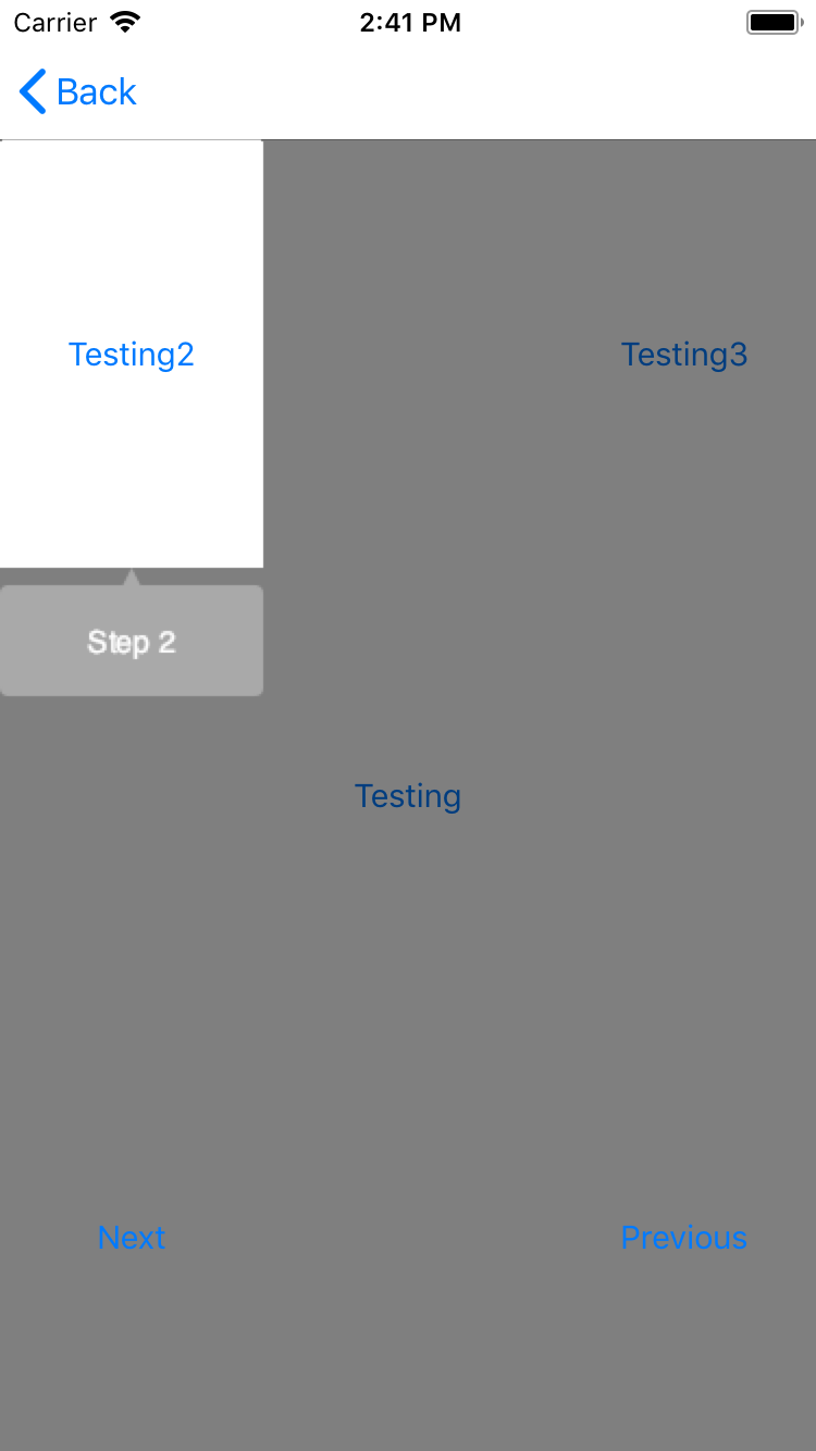
Tutorial Overlay Control
The Tutorial Overlay Control makes it easy to implement tutorial screens that highlight functionality within your UI.