Image View
The Tile allows you to make highly stylized buttons through a highly customizable control. By using this control, you can create buttons with a variety of colors, fonts, shapes, sizes and images.
Properties
EmbeddedImageName - string
Gets or sets the name of the embedded image. Default value is null.
OverlayColor - Color
Gets or sets the color of the overlay. Default value is Transparent.
MaxImageSize - Size
Gets or sets maximum size of the embedded image. Default is -1d.
Example Usage
Xaml
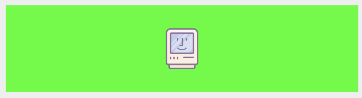
<aurora:ImageView x:Name="ImageView" HeightRequest="88" BackgroundColor="Lime" EmbeddedImageName="device.svg" />
C#
var image = new ImageView
    {
        EmbeddedImageName = "device.svg",
        HeighRequest = 70,
        BackgroundColor = Color.Green
    };