Circular Fill Gauge
The Circular Fill Gauge offers a unique way to display progress and percentages through a colorful graph.
Properties
ProgressPercentage - double
Gets or sets the progress percentage.
ProgressColor - Color
Gets or sets the color of the progress. Default value is Color.Default.
ProgressBackgroundColor - Color
Gets or sets the color of the progress background. Default value is Color.Default.
Methods
Task<bool> TransitionTo(double progressPercentage, uint rate = 16, uint length = 250, Easing easing = null)
Transitions the progress percentage. Returns a Task boolean when the Task is complete.
progressPercentage: Progress percentage.
rate: The time, in milliseconds, between frames.
length: The number of milliseconds over which to interpolate the animation.
easing: The easing function to use to transision in, out, or in and out of the animation.
Example Usage
Xaml
<aurora:CircularFillGauge x:Name="gauge1" ProgressColor="#59ff0000" ProgressBackgroundColor="Gray" />
C#
var circle = new CircularFillGauge
{
    ProgressColor = Color.Brown,
    ProgressBackgroundColor = Color.White
};
Example Styles
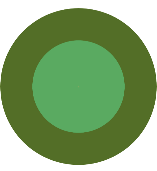
A gauge with a ProgressPercentage of 25, ProgressColor of Aqua and ProgressBackgroundColor of Black:
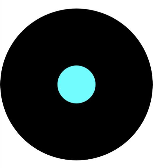
var circle = new CircularFillGauge
{
    ProgressPercentage = 25,
    ProgressColor = Color.Aqua,
    ProgressBackgroundColor = Color.Black
};
<aurora:CircularFillGauge x:Name="circle" ProgressColor="#00FFFF" ProgressBackgroundColor="Black" ProgressPercentage="25" />
A gauge with a ProgressPercentage of 75, ProgressColor of Navy and ProgressBackgroundColor of Purple:
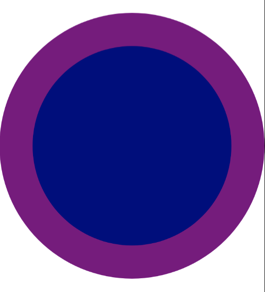
var circle = new CircularFillGauge
{
    ProgressPercentage = 75,
    ProgressColor = Color.Navy,
    ProgressBackgroundColor = Color.Purple
};
<aurora:CircularFillGauge x:Name="circle" ProgressColor="Navy" ProgressBackgroundColor="Purple" ProgressPercentage="75" />