Segmented Control
The Segmented Control gives you the ability to provide a control to your users that mimics those found on iOS. This control provides multiple tap areas used to divide certain portions of a screen in your app. It also allows the user to choose between multiple selections in a clean control.
Properties
SegmentControlStyle - SegmentedControlStyle
Gets or sets the style of the control. Default value is SegmentedControlStyle.Cupertino.
ControlForegroundColor - Color
Gets or sets the foreground color. Default value is CupertinoActiveBlue.
ControlBackgroundColor - Color
Gets or sets the background color. Default value is White.
BorderSize - double
Gets or sets the border size. Default value is 2d.
FontSize - double
Gets or sets the font size. Default value is DefaultButtonFontSize.
Typeface - SKTypeface
Gets or sets the typeface.
CornerRadius - int
Gets or sets the corner radius. Default value is 4.
SelectedIndex - int
Gets or sets the selected index of the control. Default value is -1.
Example Usage
Xaml
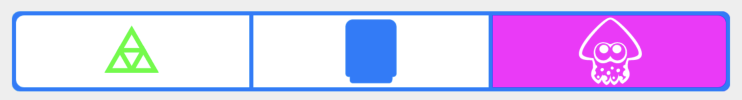
<aurora:SegmentedControl x:Name="SegmentedControl" SegmentControlStyle="Cupertino">
                <aurora:SegmentedControl.Segments>
                    <aurora:Segment Text="Test 1" ForegroundColor="Lime" EmbeddedImageName="triforce.svg" />
                    <aurora:Segment Text="Test 2" EmbeddedImageName="device.svg" />
                    <aurora:Segment Text="Test 3" ForegroundColor="Fuchsia" EmbeddedImageName="splatoon.svg" />
                </aurora:SegmentedControl.Segments>
            </aurora:SegmentedControl>
C#
var segment = new SegmentedControl
    {
        SegmentControlStyle = SegmentedControlStyle.Cupertino
    };