Check Box
The Check Box is fun and functional way to add a variety of check box styles for checked items within your app.
By allowing you to change the color and shape, you can style the check box to easily match the theme of your app.

Properties
IsToggled - bool
Indicates whether the check box is checked or not.
BorderColor - Color
Gets or sets the color of the border.
BackgroundColor - Color
Gets or sets the color of the background. Default is Transparent.
ToggledBackgroundColor - Color
Gets or sets the color of the background once the IsToggled property is true. Default is Transparent.
CheckColor - Color
Gets or sets the color of the checkmark itself. Default is Black.
BorderWidth - int
Gets or sets the width of the border. Default is 6.
MarkWidth - int
Gets or sets the width of the checkmark. Default is 6.
CornerRadius - double
Gets or sets the radius of the corners. Default is 8d.
Shape - CheckBoxShape
Gets or sets the shape of the check box itself. Default is Circular. CheckBoxShape provides the following settings:
public enum CheckBoxShape
    {
        Square,
        Circular,
        RoundedSquare
    }
CheckType - CheckBoxCheckType
Gets or sets the style of the checkmark itself. Default is Check. CheckBoxCheckType provides the following settings:
public enum CheckBoxCheckType
    {
        Cross,
        Check,
        RoundedCheck,
        Circular
    }
Value - object
Gets or sets the value.
Example Usage
Xaml
<aurora:CheckBox BorderColor="Aqua" XColor="Fuchsia" ToggledBackgroundColor="Purple"></aurora:CheckBox>
C#
var checkbox = new Aurora.Controls.CheckBox
    {
        CheckType = Aurora.Controls.CheckBox.CheckBoxCheckType.Cross,
        BackgroundColor = Color.Brown,
        XColor = Color.White,
        Shape = Aurora.Controls.CheckBox.CheckBoxShape.Square
    };
Example Styles
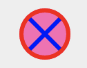
A checkbox with BorderColor of Red, XColor of Blue, ToggledBackgroundColor of HotPink and CheckType of Cross:
var checkbox = new Aurora.Controls.CheckBox
    {
        CheckType = Aurora.Controls.CheckBox.CheckBoxCheckType.Cross,
        ToggledBackgroundColor = Color.HotPink,
        XColor = Color.Blue,
        BorderColor = Color.Red
    };
<aurora:CheckBox BorderColor="Red" XColor="Blue" ToggledBackgroundColor="#FF69B4" CheckType="Cross" ></aurora:CheckBox>
A checkbox with Shape of Square, BorderColor of Green, XColor of Black, MarkWidth of 20, ToggledBackgroundColor of Purple and CheckType of Cross:

var checkbox = new Aurora.Controls.CheckBox
    {
        CheckType = Aurora.Controls.CheckBox.CheckBoxCheckType.Cross,
        ToggledBackgroundColor = Color.Purple,
        XColor = Color.Black,
        BorderColor = Color.Green,
        Shape = Aurora.Controls.CheckBox.CheckBoxShape.Square
    };
<aurora:CheckBox BorderColor="Green" XColor="Black" ToggledBackgroundColor="Purple" CheckType="Cross" Shape="Square" ></aurora:CheckBox>