Check Box Group
The Check Box Group allows you to place Aurora's check box controls into a functional, useful and convenient whole. Use it in conjunction with Check Box Layout to link the group to the layout in your interface.
Properties
AllowEmptySelection - bool
Gets or sets the ability to allow empty selections.
SelectedValue - CheckBox
Gets the selected value of a check box selection.
Example Usage
C#
var checkGroup = new CheckBoxGroup
            {
                AllowEmptySelection = false,
                Children = {
                    check1, check2, check3, check4
                }
            };
Example Styles
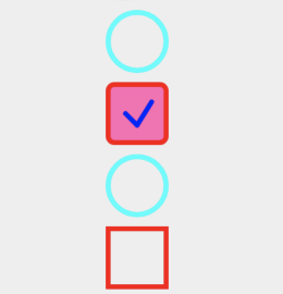
Simply call the properties on the children to change the style of the check boxes within the group. Using the above group as an example:
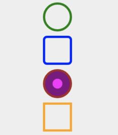
check1.BorderColor = Color.Green;
check2.BorderColor = Color.Blue;
check3.BorderColor = Color.Brown;
check4.BorderColor = Color.Orange;