Circular Gradient Control
The Circular Gradient allows the developer to easily transform any SVG into a beautiful, circular gradient effect.
This control makes it easy to stylize an SVG in multiple ways without having to suffer the tedium of editing the source file.

Properties
BorderWidth - double
Gets or sets the width of the border. Default is 10d. This will control the thickness of the border, with a higher value being thicker than a lower value.
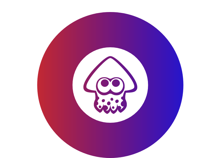
An image with a BorderWidth of 120:
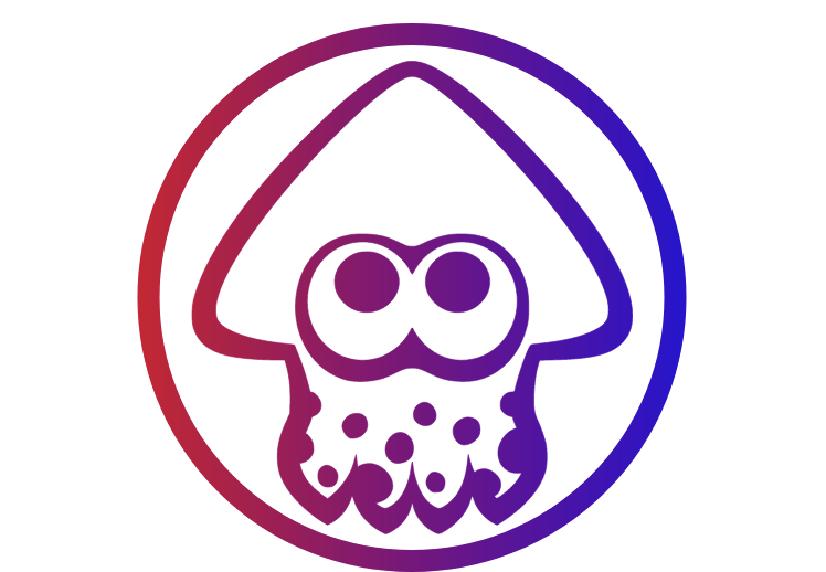
An image with a BorderWidth of 20:
EmbeddedImageName - string
Gets or sets the name of the embedded image.
GradientRotationAngle - double
Gets or sets the gradient rotation angle. Default is 0d. This changes the angle of the gradiant within the border, not the angle of the image itself. Can be set with values between -360 and 360.
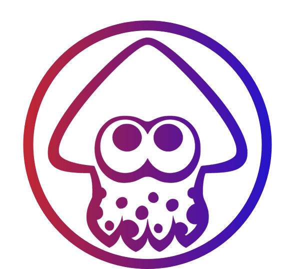
A rotation of 180 degrees:
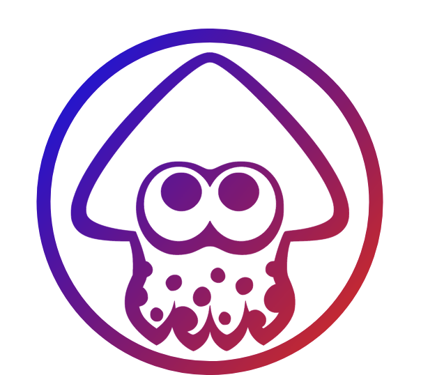
A rotation of 40 degrees:
GradientStartColor - Color
Gets or sets the color of the gradient start. Default is Xamarin.Forms.Color.Default.
GradientStopColor - Color
Gets or sets the color of the gradient end. Default is Xamarin.Forms.Color.Default.
Command - ICommand
Gets or sets the command. This will assign an action that can be run, for example, during initializiation of the view.
CommandParameter - object
Gets or sets the command parameter.
Example Usage
Xaml
<aurora:CircularGradientView x:Name="control"
                BorderWidth="10"
                HeightRequest="300"
                EmbeddedImageName="example.svg"
                GradientStartColor="Blue"
                GradientStopColor="Red"
                GradientRotationAngle="180" />
C#
var control = new Aurora.Controls.CircularGradientView
            {
                GradientStartColor = Color.Blue,
                GradientStopColor = Color.Red,
                GradientRotationAngle = 180,
                BorderWidth = 50
            };