Notification Badge
The notification badge allows you implement a badge on icons within your app in the style of badges on iOS and Android. The badge has an additional benefit of a range of customization options to better match your app's theme.
Properties
BadgeColor - Color
Gets or sets the color of the badge. Default value is Color.Red.
FontColor - Color
Gets or sets the color of the font. Default value is Color.White.
TooManyNotificationsSymbol - string
Gets or sets the symbol for too many notifications. Default is infinity symbol (∞).
FontSize - double
Gets or sets the font size. Default is 16d.
Typeface - SKTypeface
Gets or sets the typeface.
MaxBadgeSize - double
Gets or sets the maximum size of the badge itself. Default is 0d.
HideBadgeIfZero - bool
Gets or sets a value determining whether or not to hide the badge if there are no notifications.
HasShadow - bool
Gets or sets a value that determines if the notification has a shadow or not.
ShadowSpread - double
Gets or sets the shadow spread. Default is 2d.
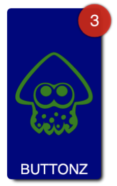
NotificationCount - int
Gets or sets the amount of notifications. Default is 0.
Example Usage
Xaml
<aurora:NotificationBadge x:Name="tile1Badge" NotificationCount="3"></aurora:NotificationBadge>
C#
var badge = new NotificationBadge
{
    NotificationCount = 4,
    BadgeColor = Color.Orange,
    FontSize = 12
};