Cutout Overlay Control
The Cutout Overlay Control allows the developer to stylize and shape an image and its surrounding superview.
Properties
CutoutShape - CutoutOverlayShape
Gets or sets the cutout shape. Default is Circular. The shape can be set to one of the following:
 public enum CutoutOverlayShape
    {
        Circular,
        Oval,
        Square,
        Rectangular
    }
Circular

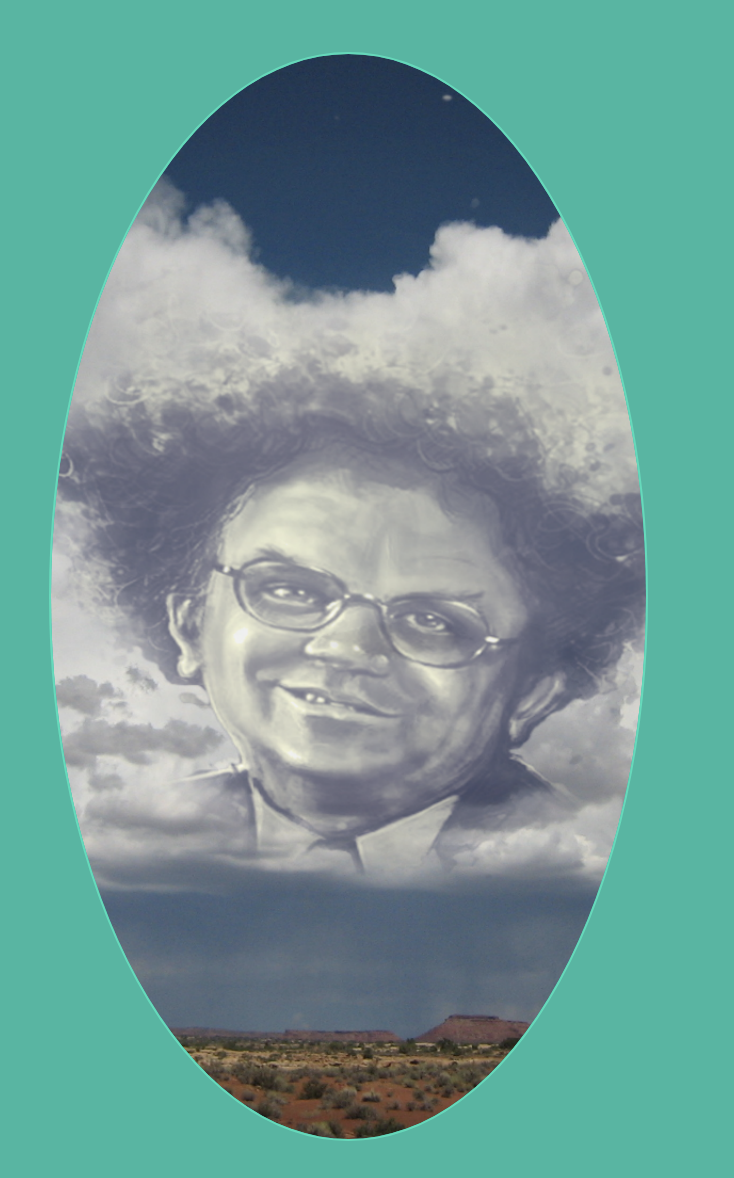
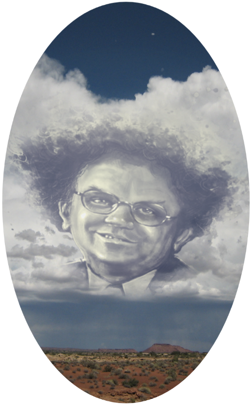
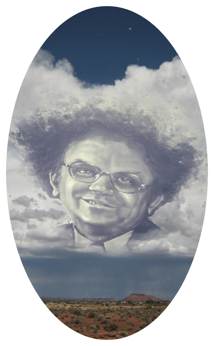
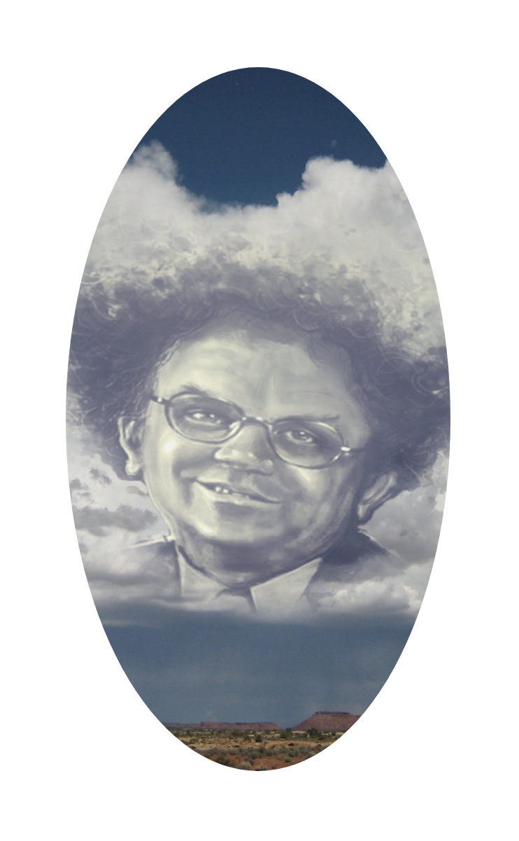
Oval
Square

Rectangle

CutoutOverlayColor - Color
Gets or sets the color of the cutout overlay. Default is White. This is the color of the surrounding view that the image is placed in.
A CutoutOverlayColor of Blue:
BorderWidth - double
Gets or sets the width of the cutout area's border. Default is 0d.
A BorderWidth of 10:

A BorderWidth of 50:

BorderColor - Color
Gets or sets the color of the border. Xamarin.Forms.Color.Default.
CutoutInset - Thickness
Gets or sets the cutout inset. This property sets the distance from the edge of the image that the cutout occurs.
A CutoutInset of 25:
A CutoutInset of 100:
CornerRadius - double
Gets or sets the corner radius. Default is 2d.
A CornerRadius of 15:

A CornerRadius of 45:

Command - ICommand
Gets or sets the command.
CommandParameter - object
Gets or sets the command parameter.
Example Usage
Xaml
<aurora:CutoutOverlayView VerticalOptions="FillAndExpand" x:Name="cutoutOverlay" CutoutShape="Circular" CutoutInset="8,8,8,8"/>
C#
var cutoutOverlay = new CutoutOverlayPage
{
    CutoutShape = Aurora.Controls.CutoutOverlayShape.Circular;
    CornerRadius = 20;
    BorderWidth = 10;
};